UX design
The main goal of the 3.0 version was to reach a medical quality image rendering. For this reason, UX was left on the side for the moment. However, we describe in this section the screens that are displayed in the current version. These are very basic skeletons which expose the core parameters needed, being :
- data transfer protocol
- gain/contrast control
However, in the 4.0 version, a specific care will be given to the app. Designers, UX/UI community members have already tackled many challenges in order to provide a fluid user experience : simplicity, comfort of use and fine control of the parameters are ensured. Stay tuned ;)
current Mobile app UI
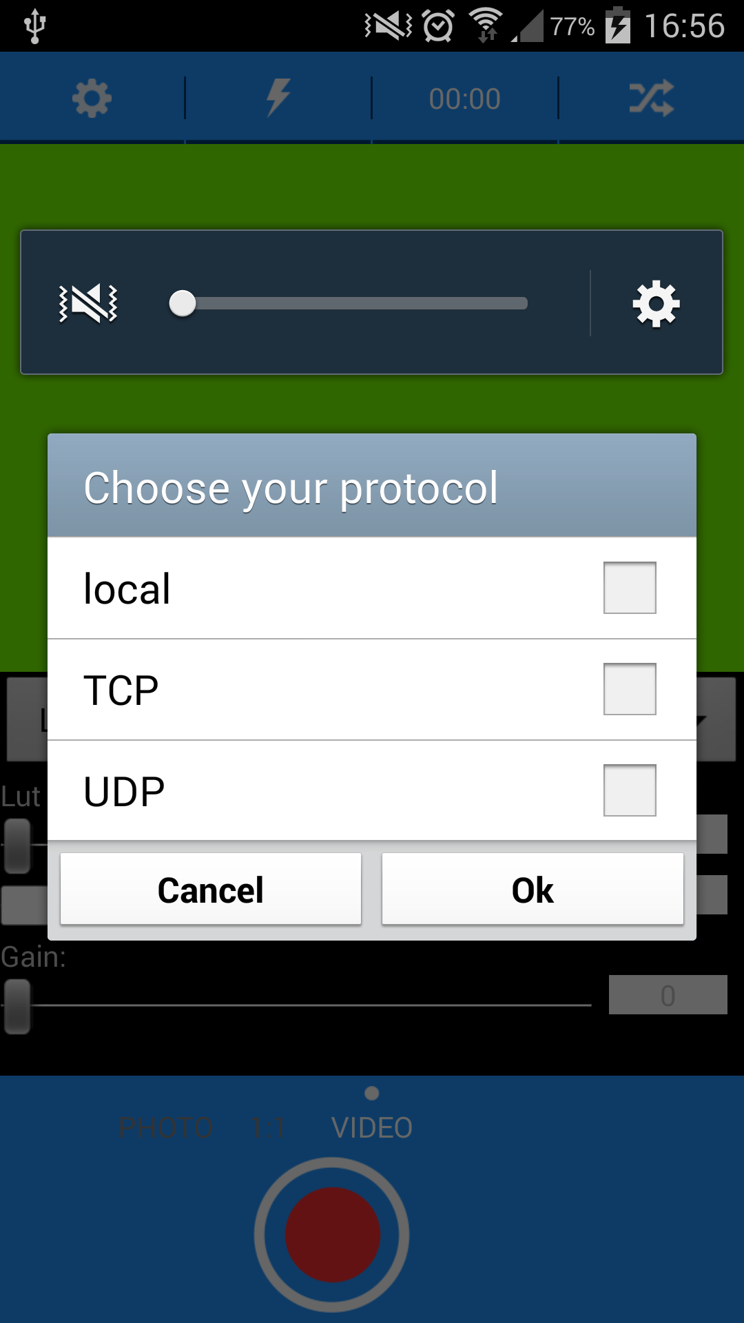
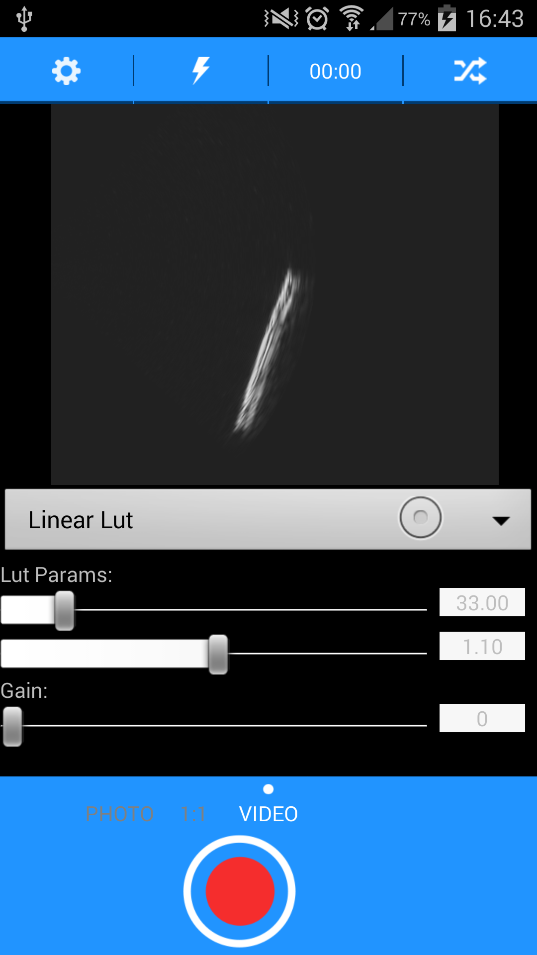
You'll find here the current UI. It is for the moment dead simple. Indeed, for this version, we choose to fix only a one-screen app, figuring the main functionalities :
- a splashscreen ;)
- a display of the image
- set a communication pipeline, enabling the choice between
- a local mode
- displaying a local file
- a TCP mode
- getting the image sent through TCP protocol. NB : the data are sent via WIFI
- a UDP mode
- getting the image sent through UDP protocol
- Remark 1: these layers were built and added one after the other, following the history of hardware evolution. The Android app sticked to these settings : first faking local utrasound data from batch files grabbed on the web, then getting data thrown through UDP protocol, hardware developers estimating that had to be tested and could be a gain of speed, but which proved not to be as consistent as we wanted related to data loss, then getting data from TCP, which is the current default choice.
- Remark 2: The current implementation stores the data in local and are served on a web local port through TCP protocol
- a local mode
- scrolling with seekBars to control contrast and image intensity
Remarks:
- contrast can be adjusted by selecting a customized intensity-to-pixels linear or exponential look-up table.
- The image intensity can also be amplified uniformly through a gain filter


